Visual Identity Guidelines
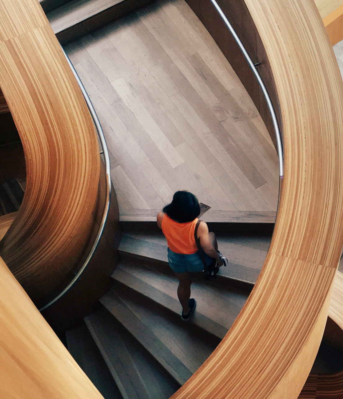
A Unique
Perspective
As our strategic vision drives us to become the broker of the future, our identity has evolved to support this audacious goal.
This rethought visual identity highlights IMA’s unique approach to consulting, honors our heritage and drives us forward.


Select One
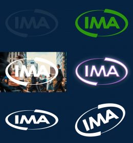

Color in Practice
Our primarily blue palate stays true to IMA’s longstanding identity, while bringing modern splashes of contrast to create a dynamic visual experience.
We bring clarity to the complex, and effective use of negative space helps support our clear, concise content.
Audacious
Blue
- Hex: #00b5e3
- Pantone: 2995
- CMYK: 71, 7, 4, 0
- RGB: 0, 181, 227
Usage: Image Overlay, Buttons, Callouts
Loyal
Blue
- Hex: #003665
- Pantone: 534
- CMYK: 100, 84, 34, 23
- RGB: 0, 54, 101
Usage: Logo, Backgrounds, Headlines, Buttons
Bill
Blue
- Hex: #002442
- Pantone: 533
- CMYK: 100, 83, 45, 50
- RGB: 0, 36, 66
Usage: Backgrounds, Headlines
Foundation
Gray
- Hex: #464e55
- Pantone: 7540
- CMYK: 71, 59, 51, 33
- RGB: 70, 78, 85
Usage: Body Copy, Headlines
Groundbreaker
Gray
- Hex: #8a8e96
- Pantone: Cool Gray 8
- CMYK: 49, 39, 34, 2
- RGB: 138, 142, 150
Usage: Pattern, Monoline, URL, Backgrounds
Heritage
Gold
- Hex: #b78a1c
- Pantone: 1255
- CMYK: 27, 43, 100, 6
- RGB: 183, 138, 28
Usage: Data, Stats, Callouts


Iconography
The monoline form of the iconography points back to the monoline asset matching the curve of the IMA logo.
We have denoted all IMA icons by adding a plussign to them, again pointing back to IMA being more than just insurance. Preferential colors are white, gray, golden hour or loyal blue.
Photography
Being more than just insurance, we are constantly working to push our imagery to more accurately reflect the communities we serve.
Each of IMA’s touchpoints have the flexibility to be diverse with the brand system.
Different designs become cohesive while utilizing the same brand assets according to the polices.


Videography
Unique perspective video shows how IMA has a unique way of looking at situations and providing solutions. Starting with close intimate shots of a scene shows IMA’s interest and understanding their clients and their needs on a personal level. Juxtapose this with a high-level view to show the bigger picture, the peace of mind that IMA is also able to see what lies ahead (future, industry experts).


Typography